

About
Rocket Lunch is a location-based mobile app concept for finding and discovering lunch menus, happy hours, and fine dining-related events for locals and ex-pats in the city. The app makes it easy to reserve and organize luncheons with friends as workmates while rewarding you for repeated visits.
Challenge:
Planning a lunch for a group of people can be stressful, especially when you need to think of food preferences, allergies, opening times, time restrictions, and hard-to-find information on current weekly menus. I asked myself "is there an easier way to do this?
My role:
-
Product strategy
-
User research & Analysis
-
Persona creation, MVP definition, Wireframes
-
UI Design & Prototyping
-
Usability Testing
Design Process
Research
Gather ideas, sketch design and user flows.
Ideation
Gather ideas, sketch design and user flows.
Design
Prototype the best ideas and craft the brand.
User Testing
Get user feedback and iterate.
1. Research
Interviews
During the research phase of my project, I interviewed six people to gain a better understanding of user challenges and motivations. These interviews helped me to discover painpoints my users had and how to solve these later with my user stories
Interview Objectives
-
Understand how users currently choose lunch menu options in the city (time, distance food preferences, etc.)
-
Understand how users create and manage their restaurant reservations
-
Uncover tools users use to make find and book restaurants
-
Learn how users feel about each tool and what are their motivations
-
Learn how users feel during their lunch planning process

Online survey
To quantify the data collected from the interviews I conducted an online survey. The questions were based on habits, motivations, and challenges while using dining-related mobile applications, creating reservations, and looking for meal recommendations.
14 questions - 20 responses

Competitive Analysis
After gathering data from the interviews and survey I performed a competitive analysis, testing six direct competitors to identify what currently is working well for users and compare their features with the expectations of my online-survey users.
I performed usability testing to determine what concepts work in terms of design patterns and user flows. In addition, I mapped the main features and identify which ones are available or only available in a limited way.

Personas
Based on interviews 4 main personas were identified:
1. No Planner John
2. Techy-savvy Lance
3. Experimental Lori
4. Expat Ted
I made sure to consider the context in which they would be using the app, their current problems, and their motivations.


2. Sketch
MVP
An MVP matrix was created early in the project to help with feature prioritization and to provide a basic version of the mobile application.
I also used the competitive analysis data and personas to identify and prioritize the core features.
The features in teal were also identified in the competitive apps
The features in orange were not available in the competitive apps
The features in grey were not implemented at this stage of the project


User flows
I have taken 3 personas: Lori, John, and Ted’s needs and goals into consideration and compiled them into one key user flows.
Creating user flows helped me to map out steps a user will take to complete their goal in the most efficient manner.
Storyboard
After listening for experiences my users found hard or painful, I turned their problems into user stories. I organized and then prioritized these before deciding which ones to solve. In the end I turned these abstract needs into concrete ideas for the application.
To brainstorm and test this initial design I created a storyboard of paper prototypes. For this, the only tools I used were pen and paper. This contained the keyframes of the main concepts. I improved the prototype over multiple iterations and adjusted the user flows.
The process was very valuable and helped me to identify changes and focus on how to solve the user’s problems without worrying about the visual design.

3. Design
Low fidelity wireframes
I continued the design process with low fidelity wireframes. This way I iterated through many design options quickly. With these wireframes I was able to clearly define the basic features and main user journey of the app.
Main features:
-
The users can search for specific restaurants or meals based on many criteria.
-
They can easily reserve if they find something worth trying.
-
They can check out personalized recommendations.
-
They can save their favorite places and lunch menus as picks.

Usability testing
With the help of Maze, I created a low fidelity, clickable prototype. I tested this prototype with 6 users. After4 tests I did one iteration on the designs and validated my solutions with the rest of the 2 users.


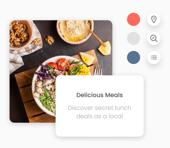
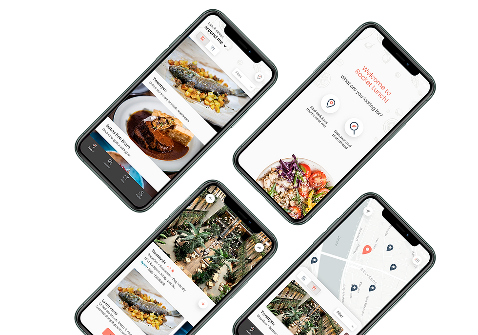
Final UI design
I experimented with a few different colors and styles as the first part of the UI design process. I checked the competition and tried to focus on visual elements which can distinguish our brand from other apps while keeping a clean look.
Final design elements:
-
Using light grey as a base color
-
Ingredient related light pattern in the background
-
Adding orange and teal as accent colors
-
Rounded edges and circles for a friendlier look
-
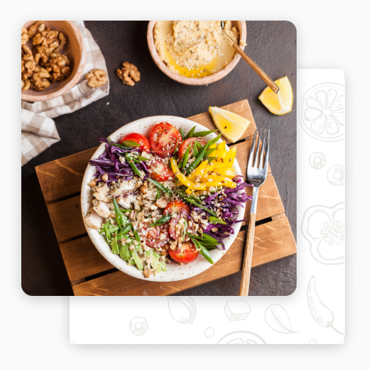
Vibrant, high-resolution food images
4. Testing
User testing
Using Userberry I created a test plan for users to complete consecutive tasks on my high fidelity prototype. I gained the following insights: completion time, heatmaps. video recordings, user flows and direct/indirect success.
Conclusion
Designing Lunch Rocket from start to finish was such a positive learning experience. Starting from the user research to high fidelity prototypes taught me so much about the user-centered design process. Having concrete understanding of how users think and feel is essential to make the right design decisions along the way.